

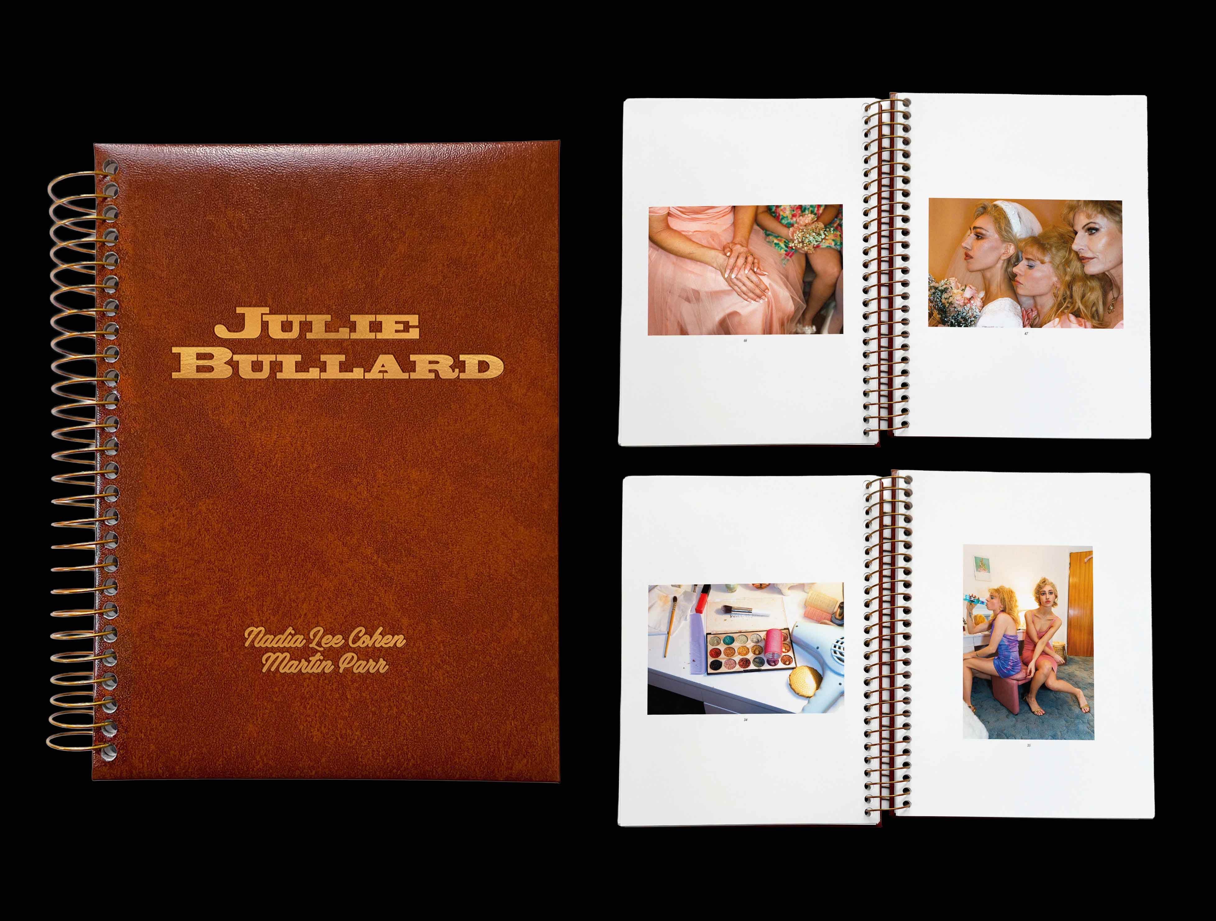
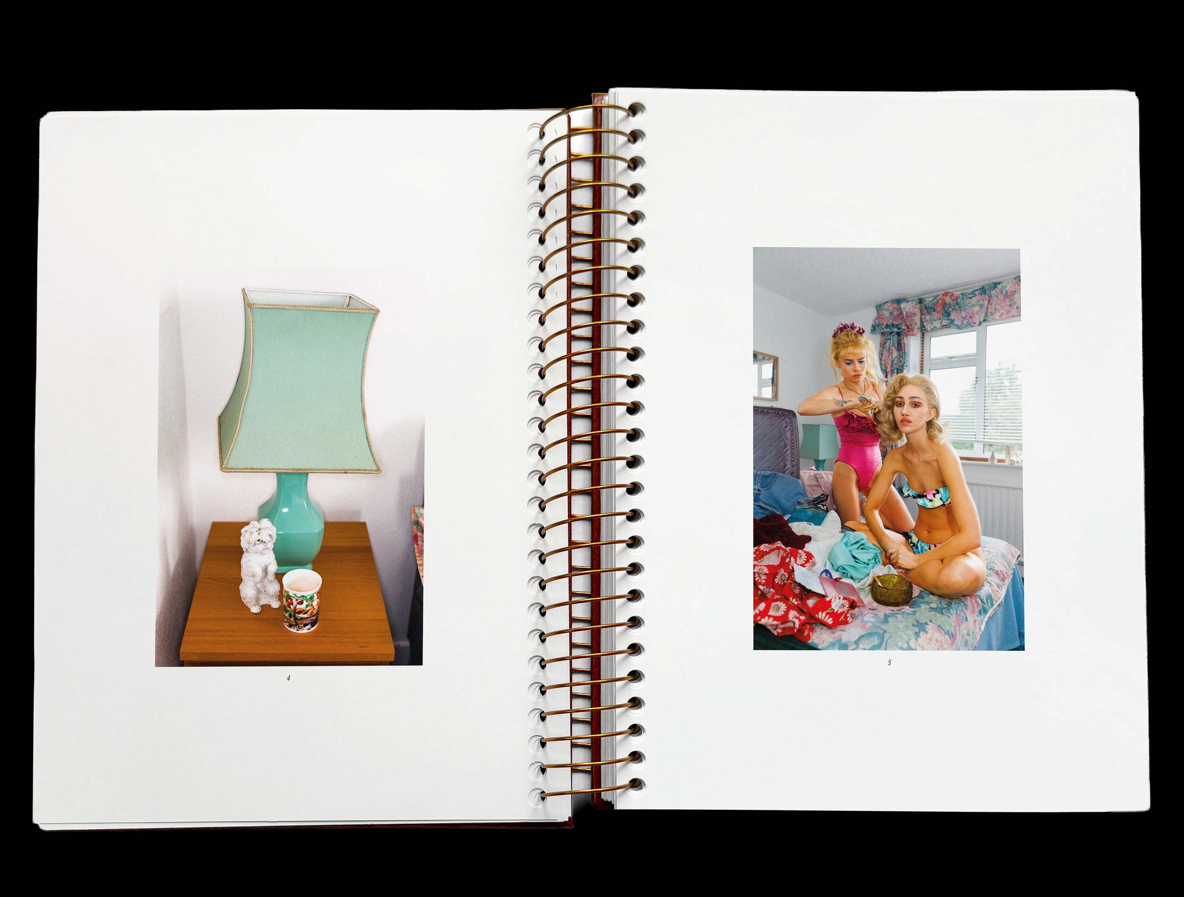
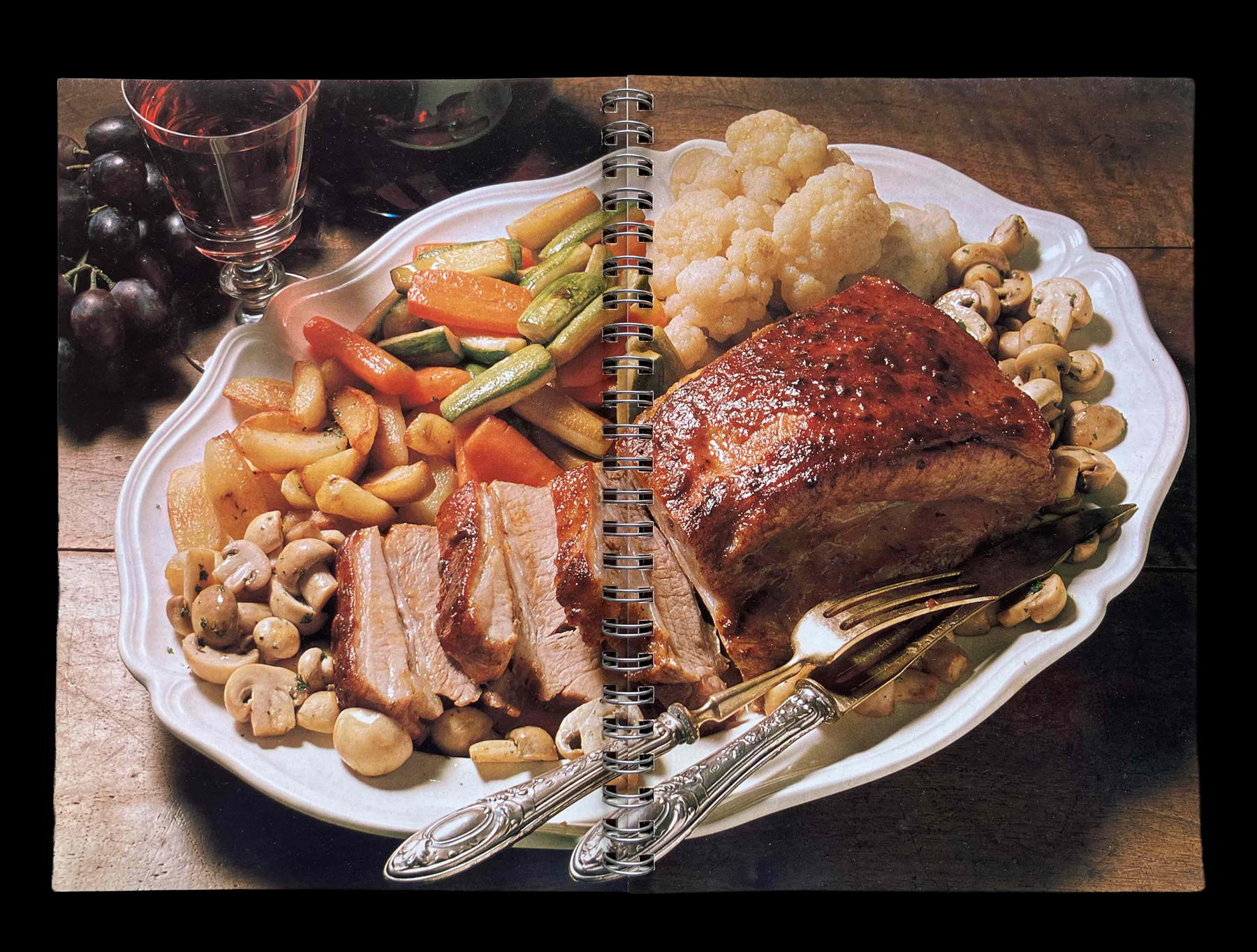
[1] Nadia Lee Cohen and Martin Parr, JULIE BULLARD (London: IDEA, 2025)
The British photographer Martin Parr documents a fictional life staged by Nadia Lee Cohen as Julie Bullard—a late-1970s-styles spiral-bound “family album” where classic Parr turns quietly uncanny through prosthetics, sets, costumes and a fiction that passes for real life.
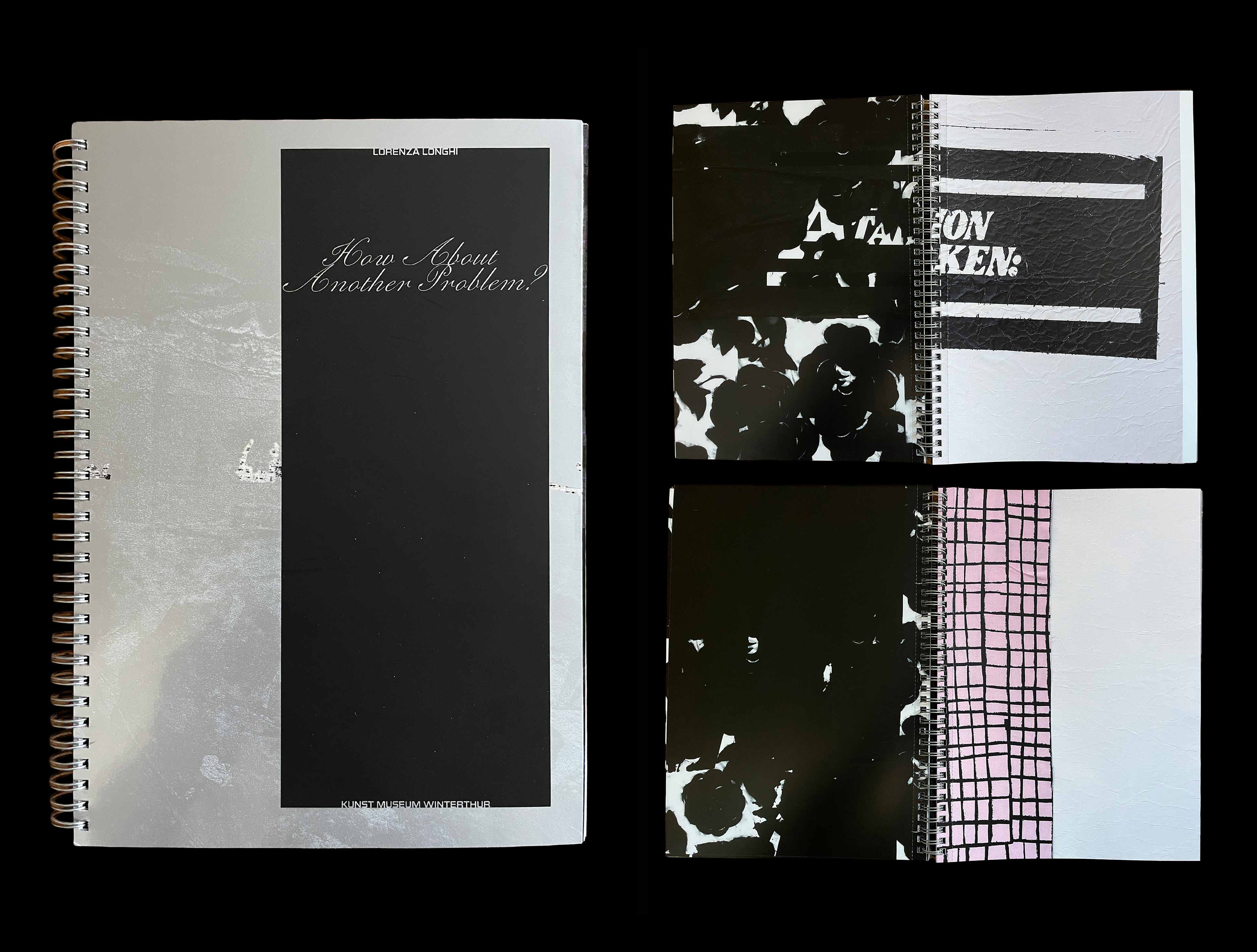

[2] Lorenza Longhi, HOW ABOUT ANOTHER PROBLEM, exhibition catalogue with texts by Konrad Bitterli and Mitchell Anderson (Milan: Kunstmuseum Winterthur / Manor Kunstpreis and Lenz, 2025)
At the beginning and end of this catalogue—designed by Anne Stock together with the artist—are bundles of photographs. They are 1:1 take-outs of paintings; they look like detail shots, but assembled and glued together they form a complete painting (for instance, ACTION TAKEN, 2025). You become the artist, the catalogue is a tool, and the painting turns into a poster. Like back in the day when teenage magazines such as BRAVO published life-size parts of posters over several issues which, when put together, turned into life-size posters of the Bay City Rollers or Duran Duran. Wade Guyton’s RINGIER ANNUAL REPORT from 2014 proposed something similar, but without the spiral binding: if you were to disassemble two ANNUAL REPORTS and tape the individual pages back together you would obtain Guyton’s full-scale work 3031, which is 8.60 metres wide and 2.75 metres high (more information here). Also interesting in this context is the postcard book GREETINGS FROM NYC, SPANNER/NYC ISSUE 5, 1985, edited by Teri Slotkin and Richard Miller, as recently presented here by Rémi Brandon: like Longhi’s book, it also features ring binding and perforation for easier ripping out. — DB


[3] Emanuele Marcuccio, artist’s book (Zürich and Brussels: Damien & The Love Guru, 2022)
In an edition of only 50, Marcuccio’s ring-bound book keeps his work in a productive suspension: surface and depth, authenticity and artifice, the “legit” and the fake. Nothing resolves; it circulates. The binding plays its part: less finished statement than provisional environment—meaning that turns rather than locks. Designed by Teo Schifferli.

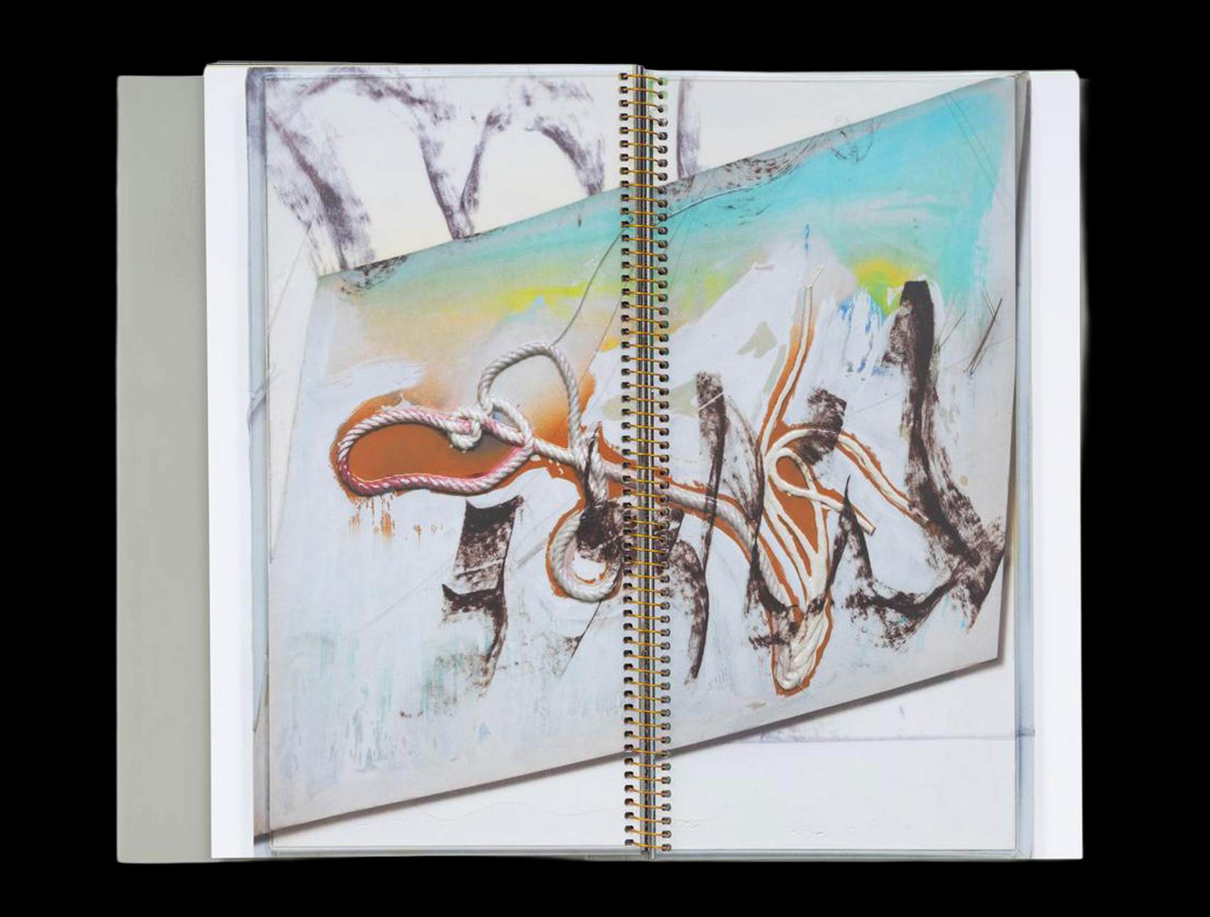
[4] Seth Price, KNOTS (Berlin: Hatje Cantz Verlag, 2018)
Price’s knot paintings are surfaces under pressure: vacuum-forming meets painterly gesture, industrial sheen meets image logic. Spiral binding keeps the book in close-up mode, pages treated as surface rather than illustration. The format mirrors the work’s hybrid status: the knots read as an index of textures to study. Spiral binding doesn’t add drama; it enables looking—a viewing table where detail isn’t subordinate to narrative.
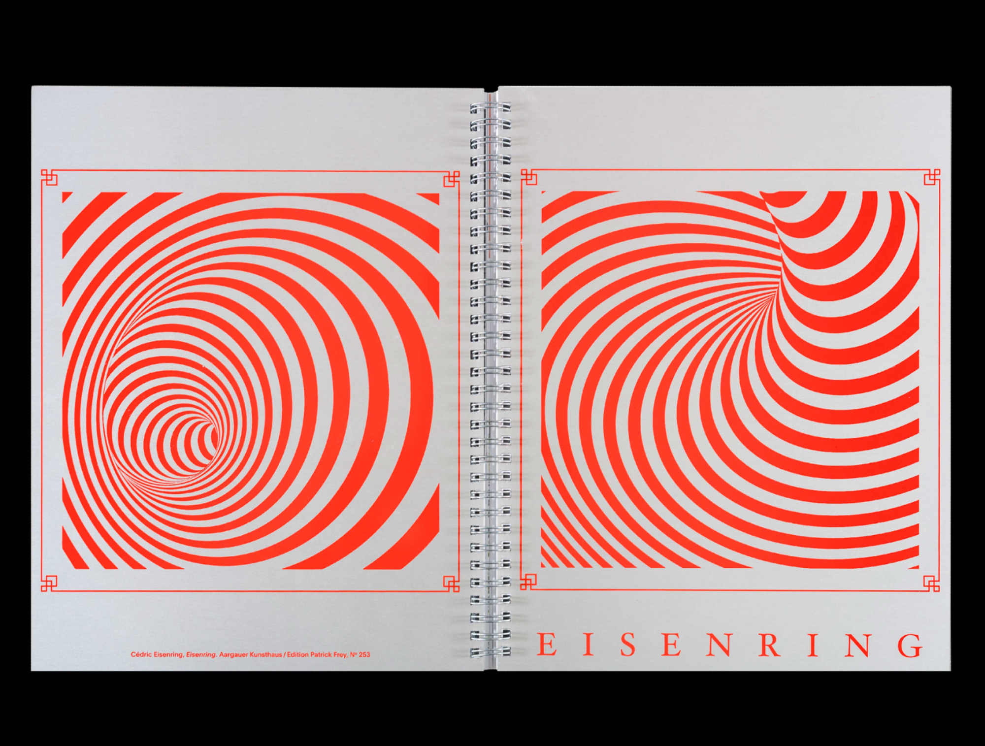
[5] Cédric Eisenring, EISENRING, with a text by Tobias Madison (Zürich: Kunsthaus Aargau / Manor Kunstpreis and Edition Patrick Frey, 2018)
Designed by Marietta Eugster, this book is, in fact, a collection of embossed prints pretending to be book pages. Leafing through it—turning page after page—is thus half the battle: you become a performer and a thinker, confronted with the mysterious, as if holding a children’s book or a codex in your hands. EISENRING is an experiment in printing technology, a collection of motifs and forms, and a book of possibilities. The spiral binding holds everything together and, at the same time, invites you to tear the book apart because, of course, every binding ties content too tightly.
— DB
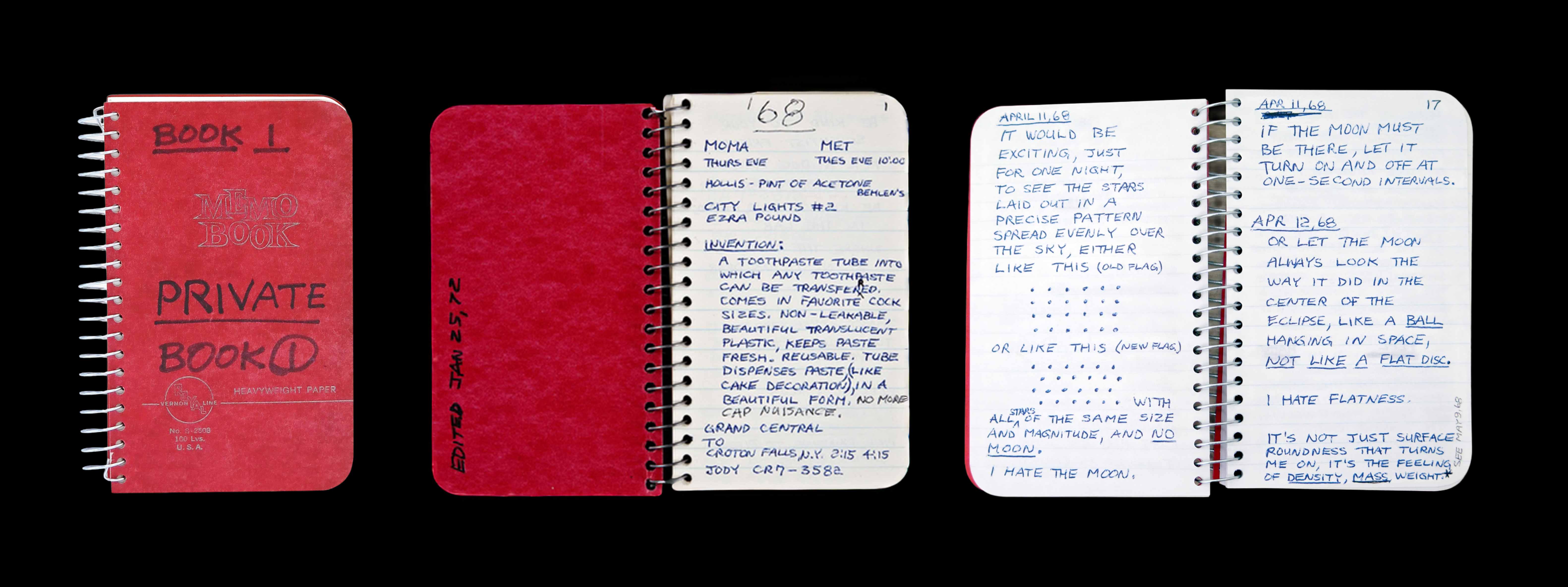
[6] Lee Lozano, PRIVATE BOOK 1 (New York: Karma, 2016)
In 2016, Brendan Dugan of Karma gallery in New York published the first PRIVATE BOOK (of a total of 11) by American artist Lee Lozano (1930–99) as a facsimile. Lozano wrote her notes in classic ring-bound notebooks, and these appealing facsimiles may have made spiral bindings acceptable again for publications, especially among young artists. “Although these details of Lozano’s personal life may read simply as gossip—and this is undeniably part of the pleasure of reading her journals—the notion of the private is closely related to overarching ideas that fundamentally formed her practice, in which boundaries between objectivity and intimacy, both in art and everyday life, were often dissolved, or at least confused.” (Madeline Weisburg)
“Finally I must say something about why I write in such small books. It is to encourage myself to maintain terseness.” (Lozano) — DB
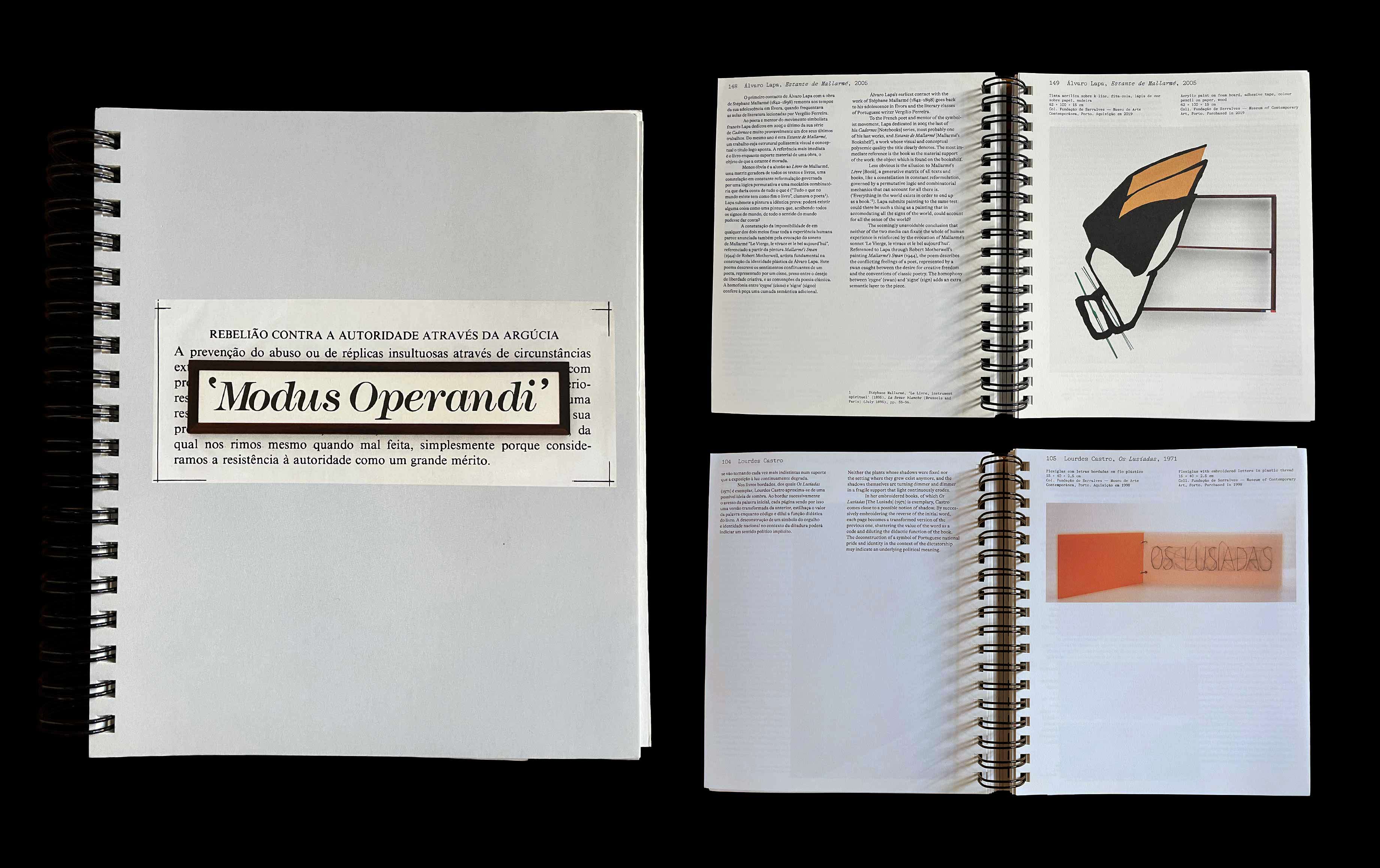
[7] MODUS OPERANDI. OBRASDA COLEÇÃO DE ARTE SERRALVES / WORKS FROM THE SERRALVES COLLECTION (Porto: Fundação de Serralves, 2014)
Designed by Márcia Novais, it presents a selection of works from the Serralves collection, selected by Philippe Vergne, its director. It presents itself as a traditional collection catalogue, but the spiral binding suggests that things could be changed, rearranged or supplemented. Possible precursors include Harald Szeemann’s legendary catalogue in the form of a folder, produced for the no less legendary exhibition LIVE IN YOUR HEAD: WHEN ATTITUDES BECOME FORM (1969) at Kunsthalle Bern. Szeemann returned to the folder format for the catalogue of DOCUMENTA 5 (1972) in Kassel (cover by Ed Ruscha). — DB
[8] Georgia Sagri, GEORGIA SAGRI AND I, edited by Christina Lehnert and Philippe Pirotte (Berlin: Hatje Cantz, 2013)
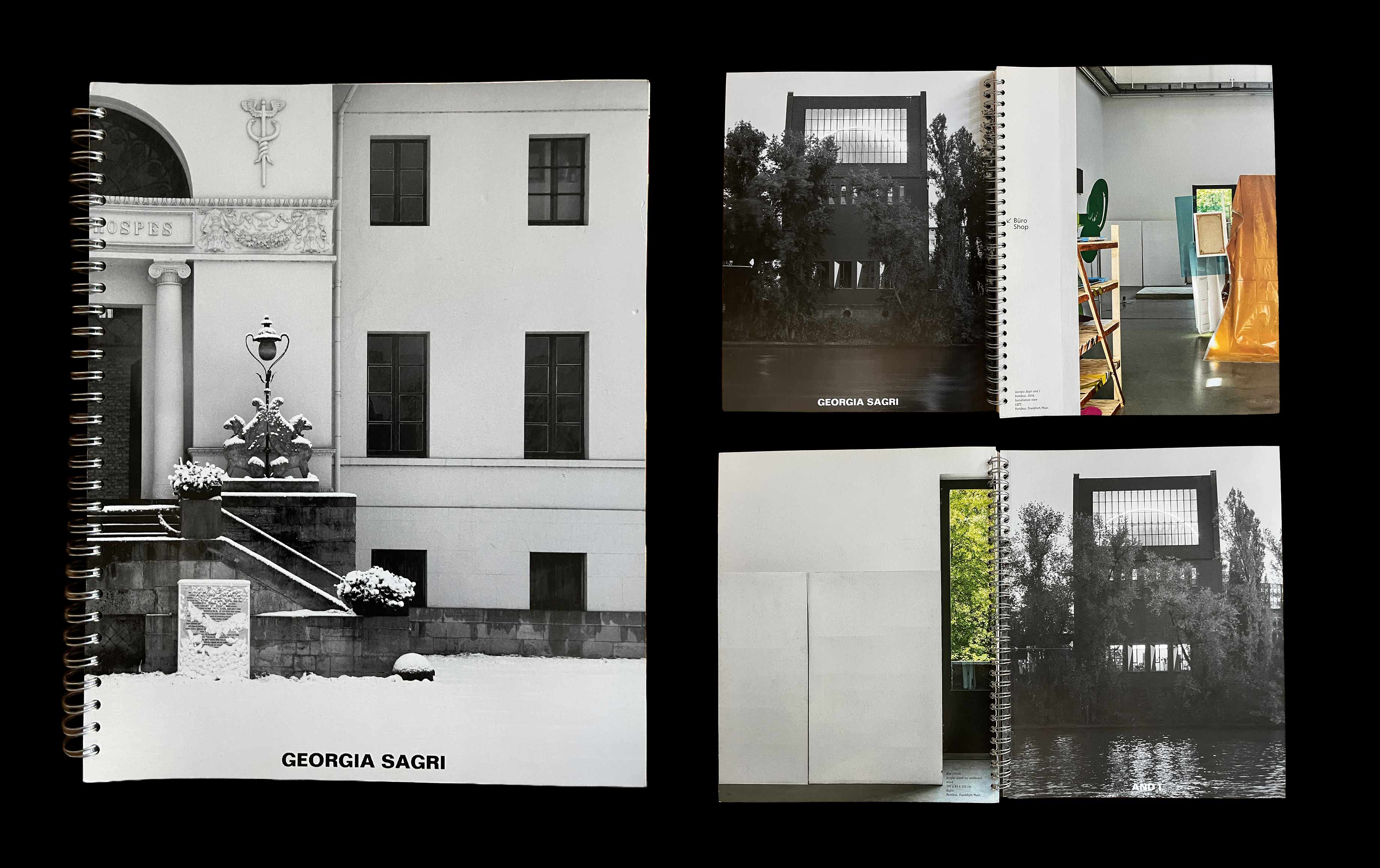
Designed by Yvonne Quirmbach (Anonymous Design), this catalogue documents Sagri’s work through archival material dating back to 1999, alongside texts and a conversation. Held together by a metallic spiral binding, each “I”, “self” or “page” can become cross-eyed through a “catastrophe of emotions”. A founding organiser of the Occupy Wall Street movement, Sagri’s social activism (alongside her artistic activities) dates back to 1997, when she was a member of the Void Network in Athens. — DB
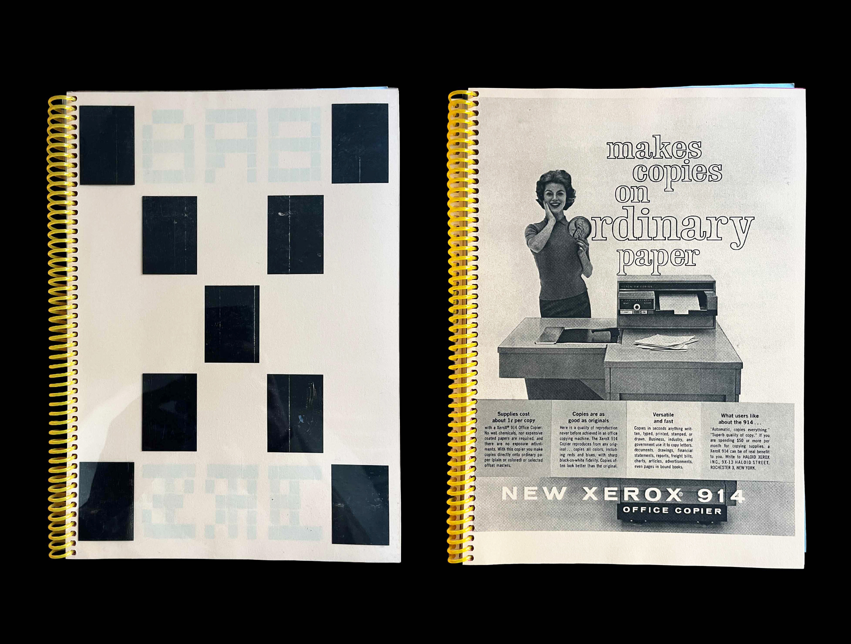
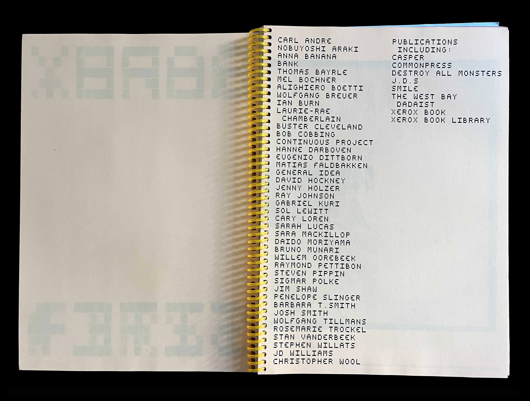
[9] Michelle Cotton and Nicolaus Schafhausen, eds, XEROGRAPHY, exhibition catalogue (Colchester: Firstsite, 2013)
In 2013, the graphic designers Kellenberger-White were invited by curator Michelle Cotton to design the exhibition XEROGRAPHY, held at Firstsite in Colchester, Essex, along with its catalogue and accompanying publicity materials. The exhibition marked the anniversary of the invention of the photocopy, and presented more than 125 works by nearly 40 artists. The catalogue brought together newly commissioned essays and extracts from key critical texts, alongside adverts from Xerox promoting their photocopiers. As Marshall McLuhan wrote in THE MEDIUM IS THE MASSAGE (1967): “You can always ‘custom-make your own book by simply Xeroxing […]’—instant steal!” — DB


[10] Lynn Hershman Leeson, THE DANTE HOTEL / THE NOVALIS HOTEL (Berlin: KW Institute for Contemporary Art, 2010)
A double publication by Lynne Hershman Leeson: a copyshop facsimile of THE DANTE HOTEL, a book made by the artist on the occasion of her legendary project in an abandoned hotel in North Beach, San Francisco, in 1973–74; and THE NOVALIS HOTEL, a documentation of the eponymous project organised in Berlin in 2008, at the invitation of Anna Gritz, curator at KW. In both cases the hotel rooms become vehicles for narratives and character-based installations, and give way to a reflection on identity and subjectivity, in relation to technologies of the self and surveillance devices. The two small catalogues document both hotel projects. They look xeroxed and were inexpensive (EUR 15.00), but are now sold out. — DB

[11] Allen Ruppersberg, YOU AND ME OR THE ART OF GIVE AND TAKE (Zürich: JRP|Ringier, 2009)
This book repurposes a 1956 “Guest Informant” booklet from San Francisco’s Mark Hopkins Hotel: its pre-existing pages function as a found template into which Ruppersberg inserts photographs (some found, some made by him), carrying and structuring the work. Spiral binding reinforces the logic of re-use and circulation: kept open, handled, worked through.


[12] CHLOË SEVIGNY FOR OPENING CEREMONY, with photographs by Mark Borthwick (New York: Opening Ceremony Press, 2008)
Spiral binding gives the publication flip-book energy: at once fan artefact, personal scrapbook, fashion document. Mark Borthwick’s photographs give Chloë Sevigny that early-2000s register—nonchalant, intimate, slightly unreal—while the format keeps the book light on its feet. You browse it more than you read it: a loop of images, gestures, moods. In ring-binding terms, it’s the glossy cousin of the zine.
[13] FOLLOW THE SIGNS, exhibition catalogue (Museum für Gestaltung Zürich, 2000)
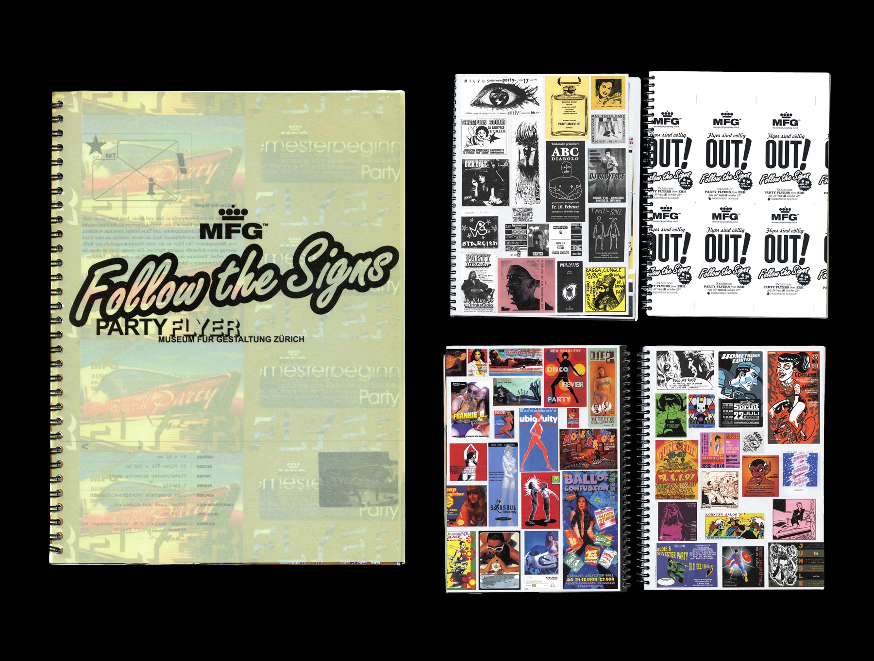
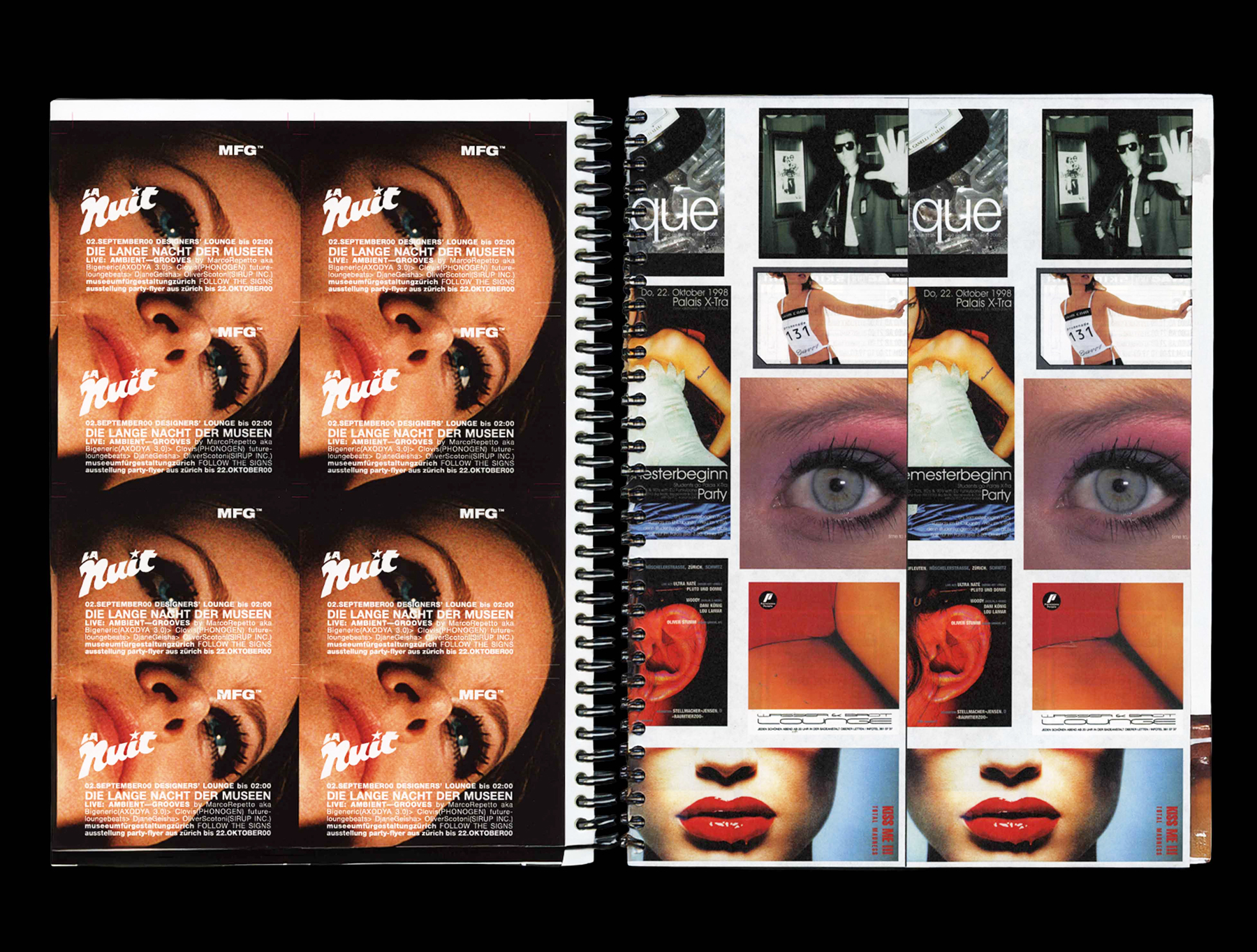
Party flyers are navigation devices—answers to what/where/when—and spiral binding is a fitting delivery system. This catalogue, designed by Schlatter Feuz Hinder, treats Zürich’s late-1980s and 1990s flyer culture as design history: not merely nightlife ephemera, but as a visual language shaped by technology, speed and distribution. Spiral binding turns the whole thing into a working archive—part collection, part manual—where the reader moves through time as if moving through a filing system. The catalogue does what flyers once did: it guides.
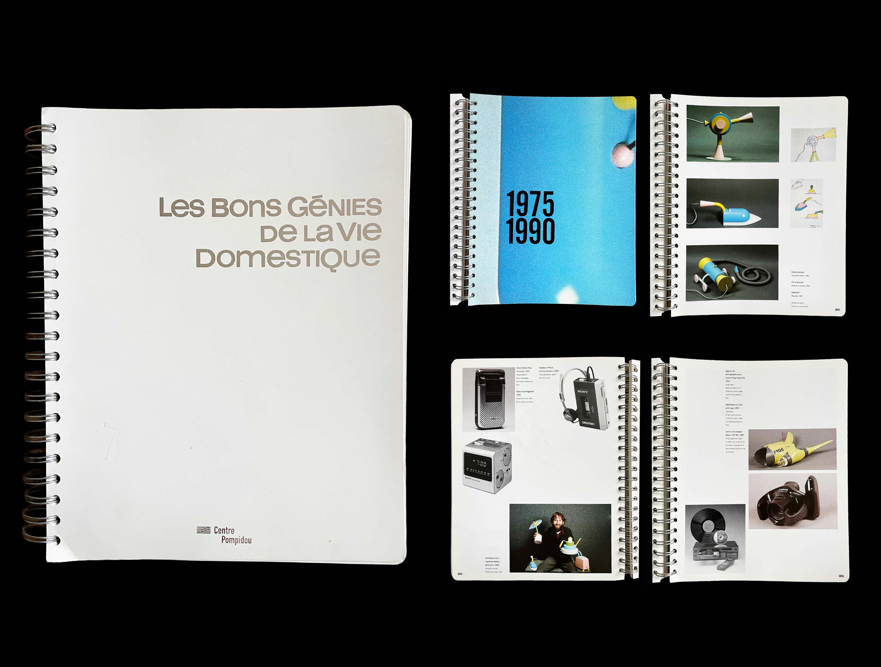
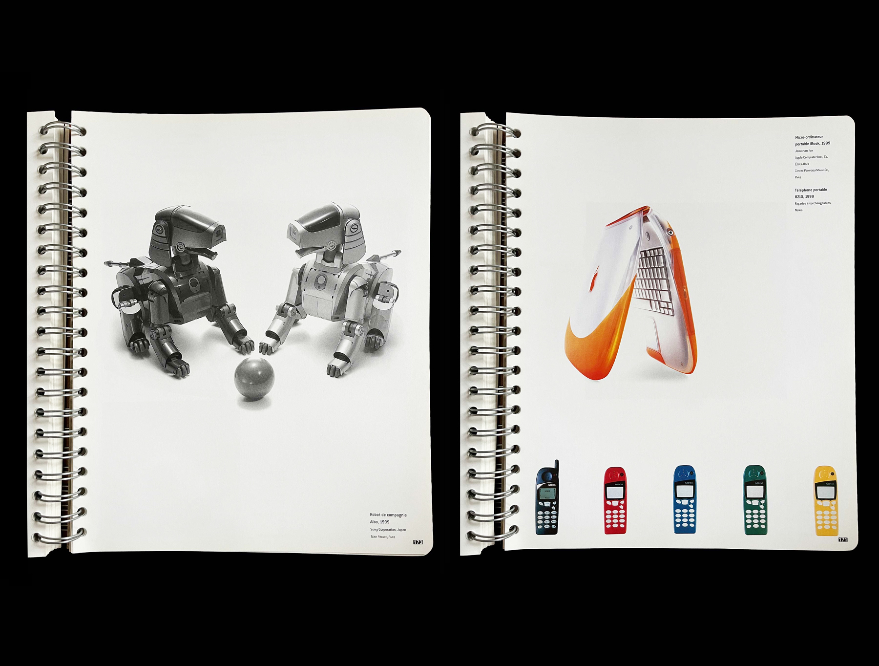
[14] LES BONS GÉNIES DE LA VIE DOMESTIQUE, exhibition catalogue (Paris: Centre Pompidou, 2000)
The spiral binding probably aims to evoke—or enforce—an association with home, the kitchen and cookbooks: LES BONS GÉNIES DE LA VIE DOMESTIQUE. “In this catalogue of the exhibition presented at the Centre Pompidou in Paris from October 2000 to January 2001, we discover with irony the ancestors of our household appliances and see that women’s liberation has been achieved through technical progress (consider the importance of the washing machine… the Salon des Arts Ménagers could just as easily have been called the Salon de la Femme). Finally, we can see the evolution of advertising posters extolling the virtues of new appliances from the beginning of the century to the present day (from Mère Denis to Carla Bruni…).” — DB
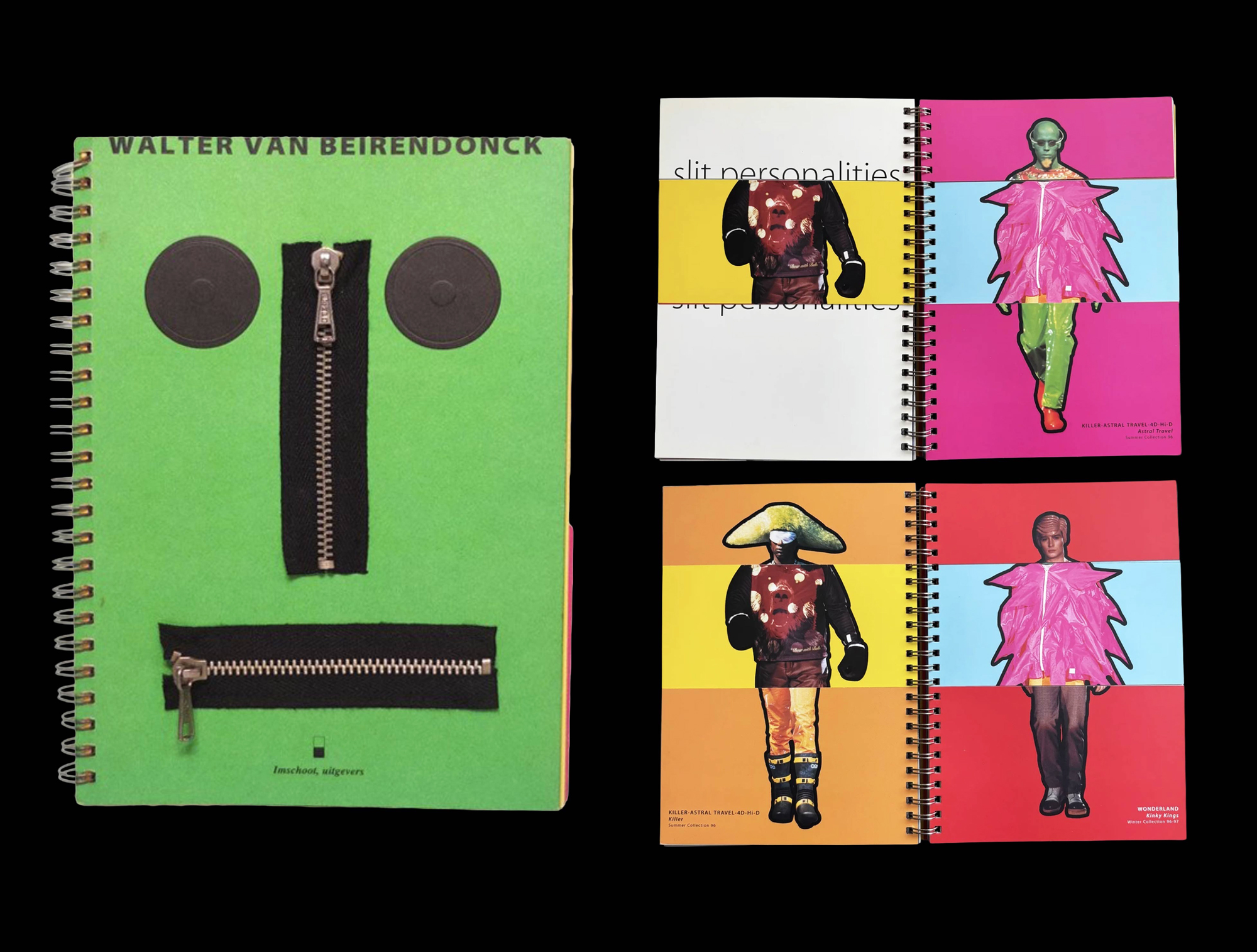
[15] Walter van Beirendonck, MULTITUDE (Ghent: Imschoot, 1998)
Spiral binding is unusually good at holding together overload—pages built for rapid scanning and back-and-forth. This book documents material from over a decade of Walter Van Beirendonck’s work in a tactile, engineered object: fold-outs, die-cuts, embossing, even hardware-like interventions. Spiral binding keeps it closer to workbook than monument.
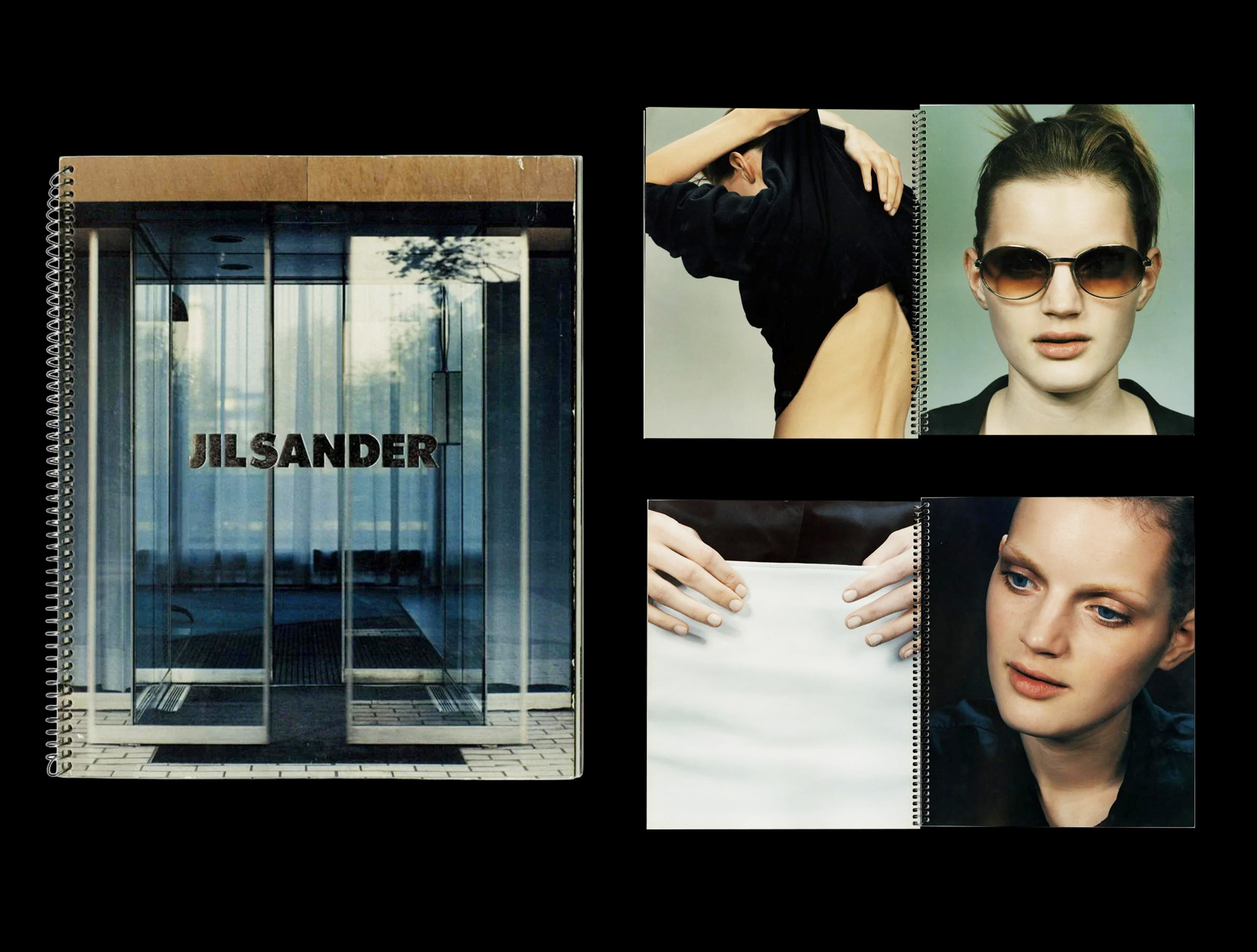
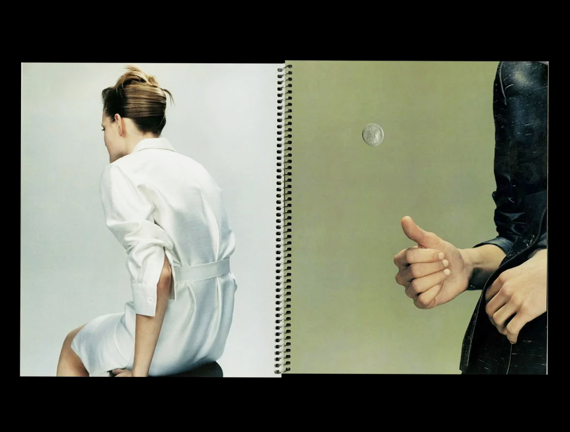
[16] JIL SANDER, SPRING / SUMMER 1996 LOOKBOOK (Milan, 1996)
A lookbook, designed by M/M (Paris), from the point at which fashion ephemera becomes conceptual object. Marc Ascoli’s art direction and Craig McDean’s restrained photography make this less a seasonal catalogue than a calibrated device: page as argument, attitude and spacing over product and marketing. With the model Guinevere van Seenus as the singular presence, the images stay coolly inward and deliberately understated. Spiral binding keeps it in album mode: open-flat, manual-like.
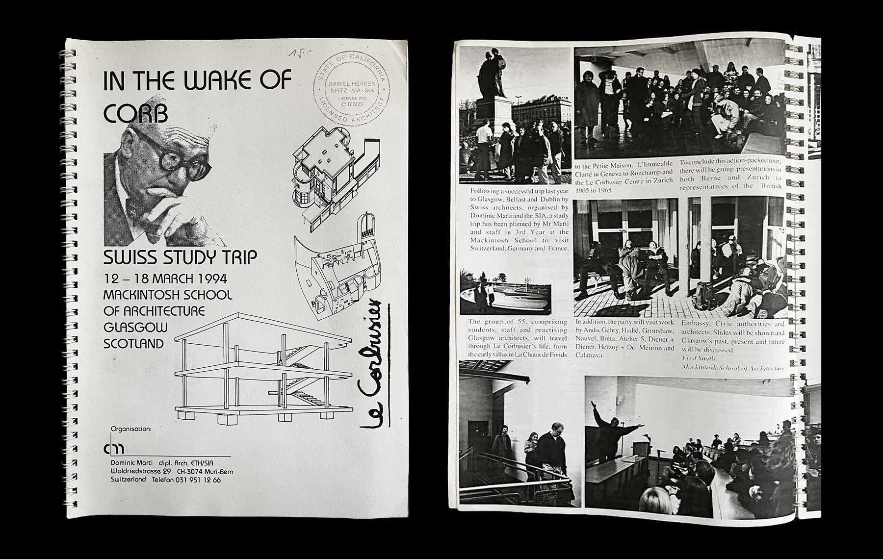
[17] Dominic Marti, IN THE WAKE OF CORB: SWISS STUDY TRIP (Muri bei Bern: self-published, 1994)
A classic example of a coil binding, also known as spiral binding, used for the programme of a study trip inspired by Le Corbusier’s architecture. — DB
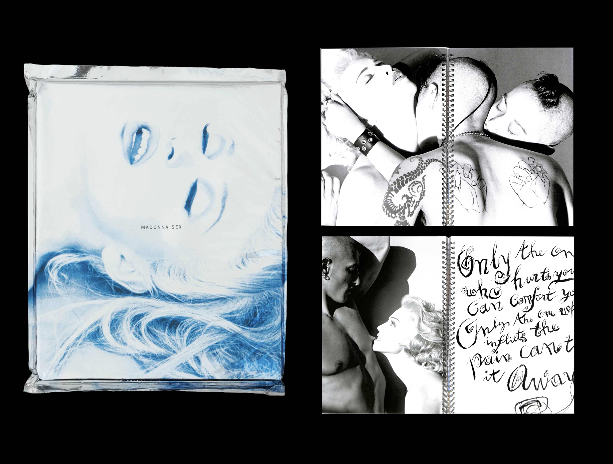

[18] Madonna, SEX (New York: Warner Books, 1992)
Spiral binding rarely arrives with this much spectacle. Designed by Fabien Baron, SEX is engineered as provocation and package: aluminium covers, spiral binding, sealed in a PET wrapper. Steven Meisel’s photographs read like an industrial sample catalogue—but here the “samples” are fantasies staged in explicit S&M scenarios, with text voiced by Madonna under the nom de plume “Mistress Dita” (after Dita Parlo).
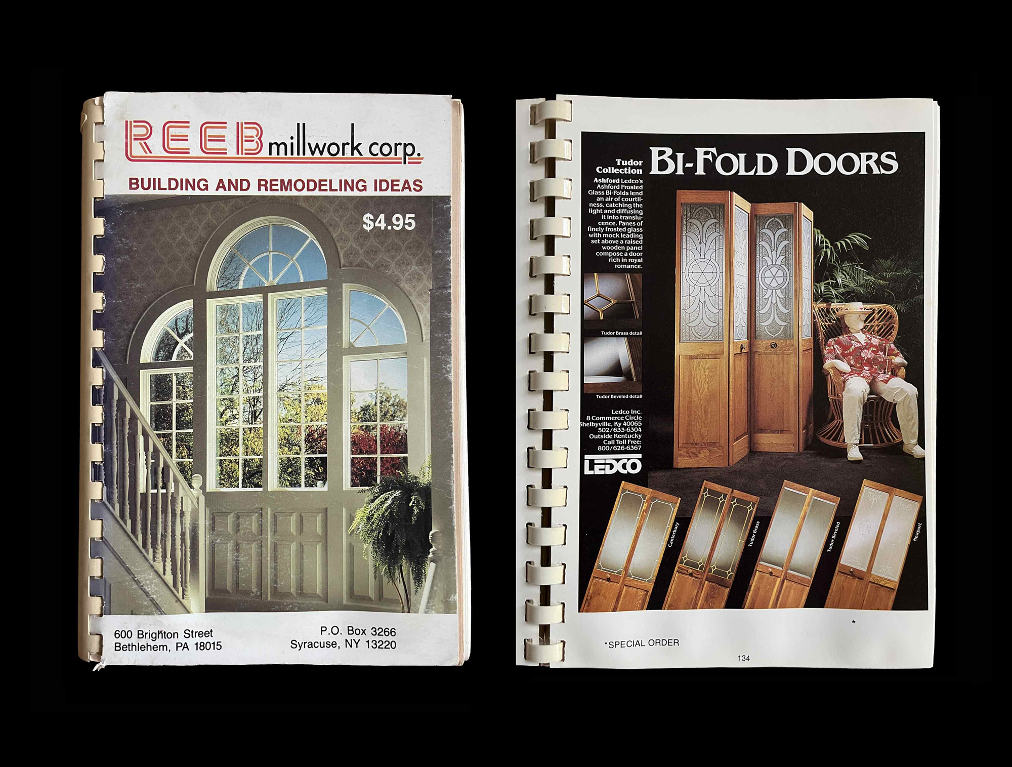
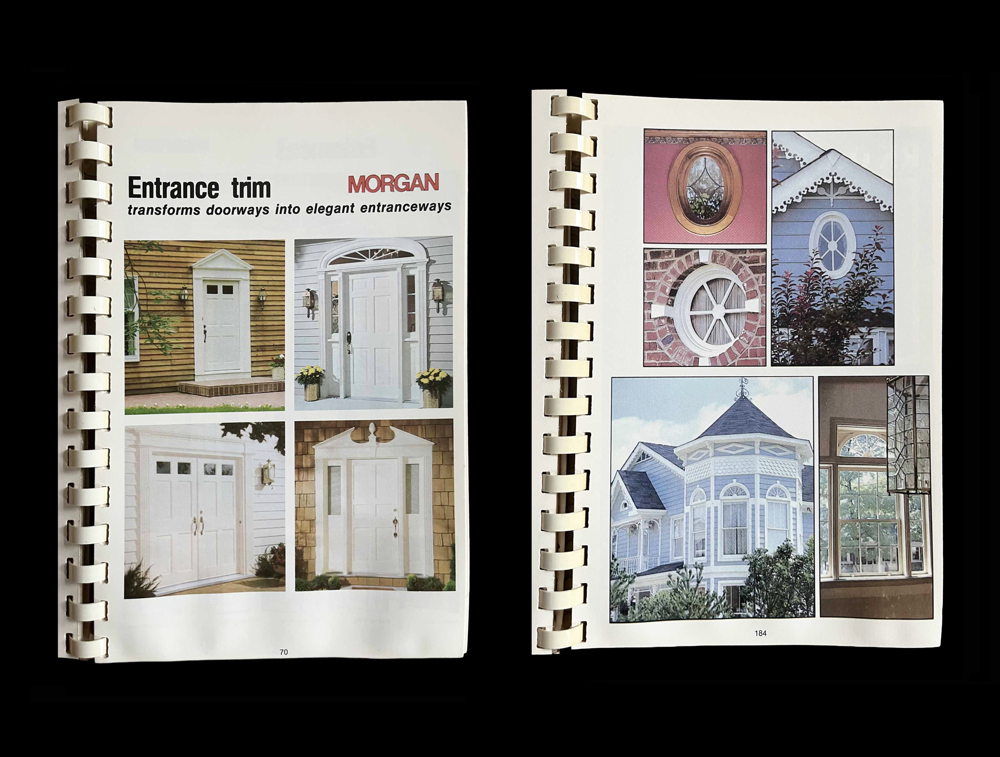
[19] Reeb Millwork Corp., BUILDING AND REMODELING IDEAS (Syracuse, NY, 1989)
“This Guide is made possible through the cooperation of the several major facets of the building materials industry.” “The Guide has been prepared particularly for you.” — DB
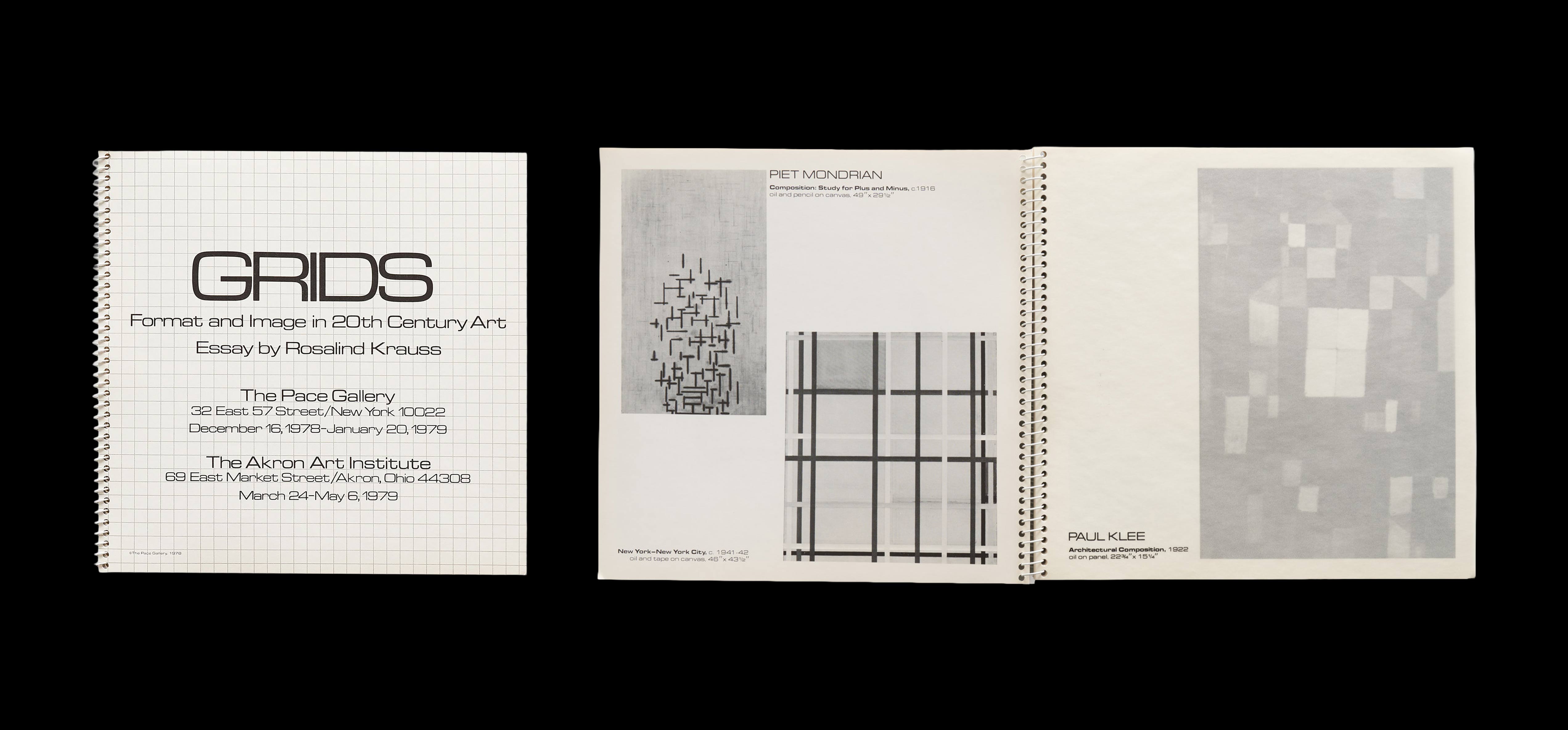
[20] GRIDS: FORMAT AND IMAGE IN 20TH CENTURY ART, exhibition catalogue with a text by Rosalind Krauss (New York: Pace Gallery, 1978)
Made to accompany a 1979 group exhibition shown at Pace in New York and the Akron Art Institute, Ohio, this catalogue brings together historic works by Josef Albers, Carl Andre, Robert Irwin, Lee Krasner, Ellsworth Kelly, Eva Hesse, Sol LeWitt, Agnes Martin, Ad Reinhardt, Louise Nevelson and Frank Stella, among others. “In the temporal dimension, the grid is an emblem of modernity by being just that: the form that is ubiquitous in the art of our century, while appearing nowhere, nowhere at all, in the art of the last one.” (Rosalind Krauss) — DB
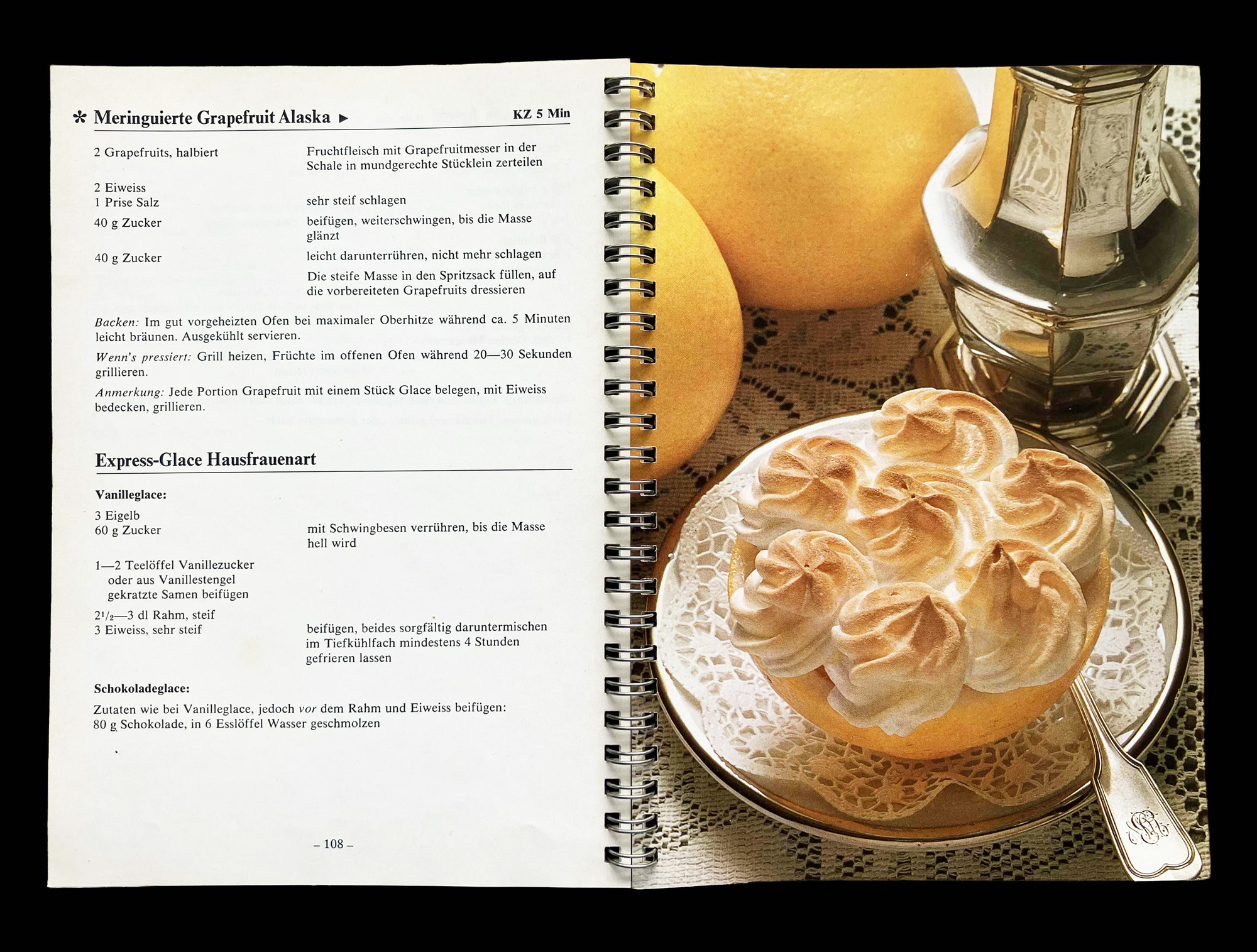
[21] ALLTAGSREZEPTE MIT PFIFF (Zürich: Betty Bossi, 1975)
Since the 1960s, BETTY BOSSI — Switzerland’s most popular cookbook series — has been published in its signature spiral-bound format. Here, spiral binding is not a design flourish but a domestic technology. It exists to keep the book open where it is needed: on a kitchen table, next to flour, butter and impatience. These books are passed down from generation to generation.
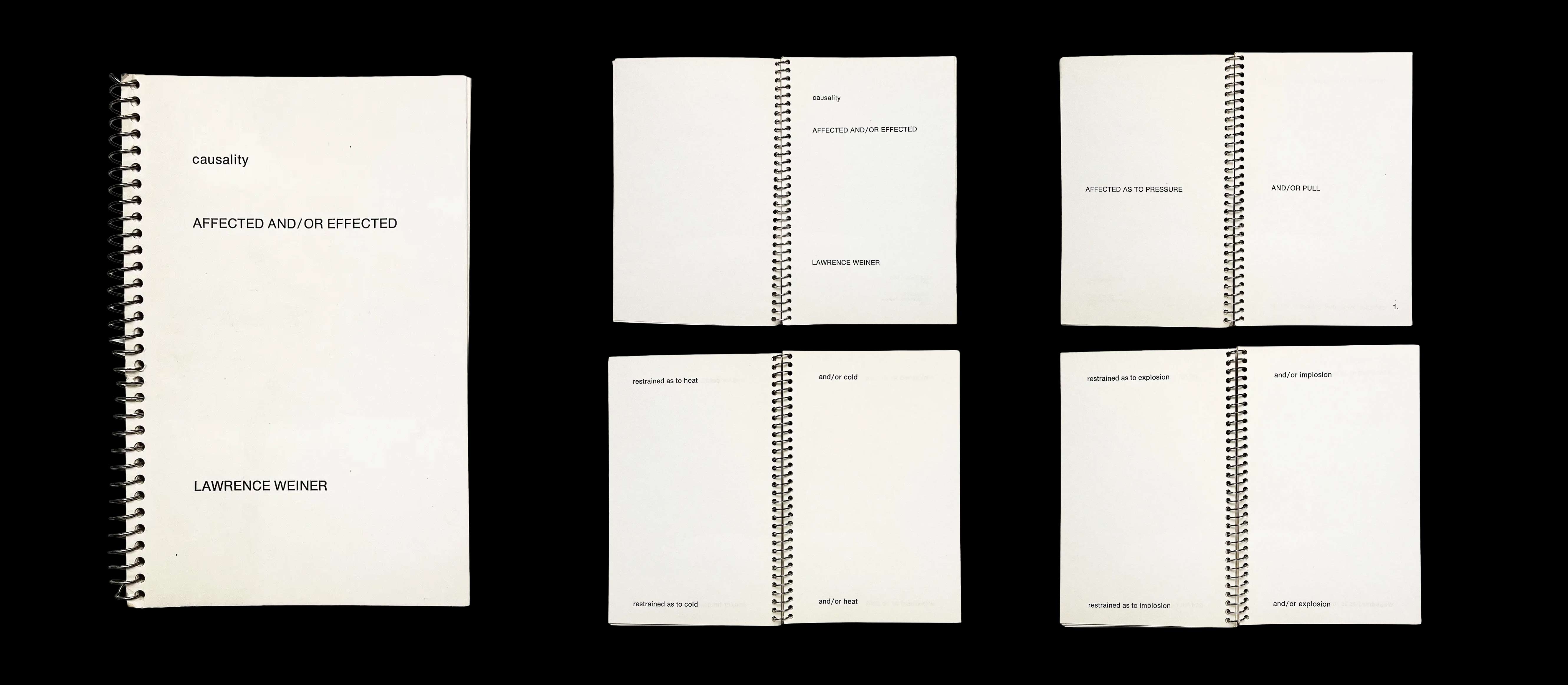
[22] Lawrence Weiner, CAUSALITY AFFECTED AND / OR EFFECTED (New York: Leo Castelli / Eminent Publications, 1971)
Weiner’s early artist’s books treat language as material: units that can be permuted, repeated, re-sequenced until meaning shifts under your hands. Presented as a manual, this spiral-bound volume intensifies that sense of use. It isn’t a book you “finish”; it’s a set of operations—protocols for interaction.


[23] Exhibition catalogue (Venice: Galleria del Leone, 1964)
This spiral-bound exhibition catalogue behaves like a reference folder—less “book” than index, an operational record of participation at a moment when the international art scene was being rapidly re-coded. Participating artists are Lucio Fontana, Hans Hartung, Georges Mathieu, Camille Bryen, Jean Fautrier, Enrico Baj, Mimmo Rotella, Cy Twombly, Paul Van Hoeydonck, Yves Klein, Martial Raysse, Arman, Michelangelo Pistoletto, Saffa e Seita, Raymond Hains, Enrico Castellani, Christo and Gérard Deschamps.
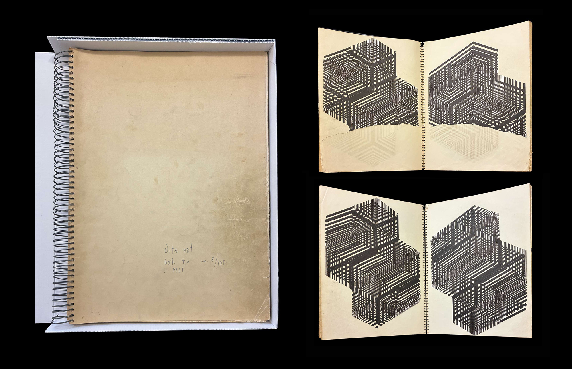
[24] Dieter Roth, BOK 4A (Reykjavik: Forlag Editions, 1961)
A spiral-bound progression of black-and-white geometric patterns, printed using letterpress and rubber blocks on double sheets. Roth works with a limited set of blocks to generate obsessive variation: each page is a self-contained pattern, keyed to the one before and after, turning “meaning” into something produced by looking—page to page—through repetition and optical dissonance.

[25] Albert Frey, IN SEARCH OF THE LIVING ARCHITECTURE (New York: Architectural Book Publishing, 1939)
Raised and trained in Switzerland, and having worked for Le Corbusier, Albert Frey (1903–98) was closely identified with Palm Springs, California, and what was known as “Desert Modernism”. Frey used the natural landscape, dwellings built by early peoples, urban planning ideas and the industrial landscape to demonstrate his theories on architecture. — DB


[26] BRASSAï, (PARIS: ÉDITIONS ARTS ET MÉTIERS GRAPHIQUES, 1933) AND [28] (Paris: Paris Publications, n.d. [c. 1935])
The spiral binding of Brassaï’s PARIS DE NUIT makes the book notoriously fragile: punched holes, paper under stress. Its open-flat handling reads as almost forensic—more private-eye dossier than spine-bound narrative. From the mid-1930s, VOLUPTÉS DE PARIS gathers Brassaï’s more risqué, intimate nocturnal photographs.
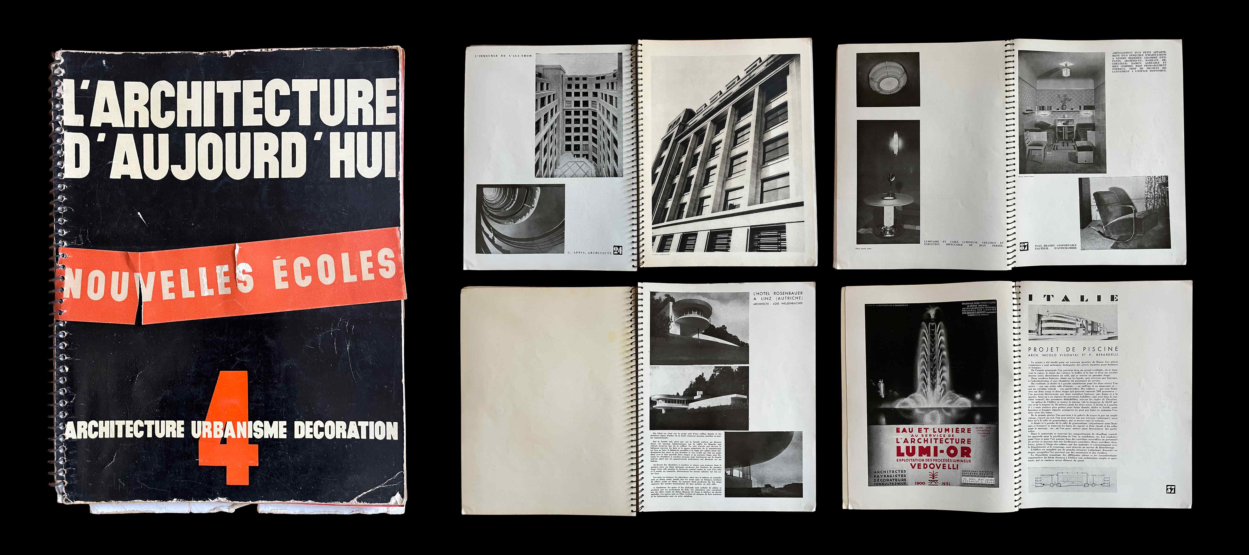
[27] L’ARCHITECTURED’AUJOURD’HUI (Paris, 1930–present)
L’ARCHITECTURE D’AUJOURD’HUI (“THE ARCHITECTURE OF TODAY”) is a French architecture magazine associated with the Modernist movement. Founded in 1930, it developed a network of international correspondents and achieved rapid success. The first issues were spiral-bound. “It is proximity, face-to-face contact and cross-fertilisation of information that enable us to understand, learn and progress. In this way, a magazine can cross-reference past, present and future. Knowledge is cumulative.” (Anne Lacaton and Jean-Philippe Vassal, architects) — DB
PS: Ring binding is all well and good, but it is a nightmare on the bookshelf: it gets crushed, rusts, tears the paper and often leaves marks on other books.